
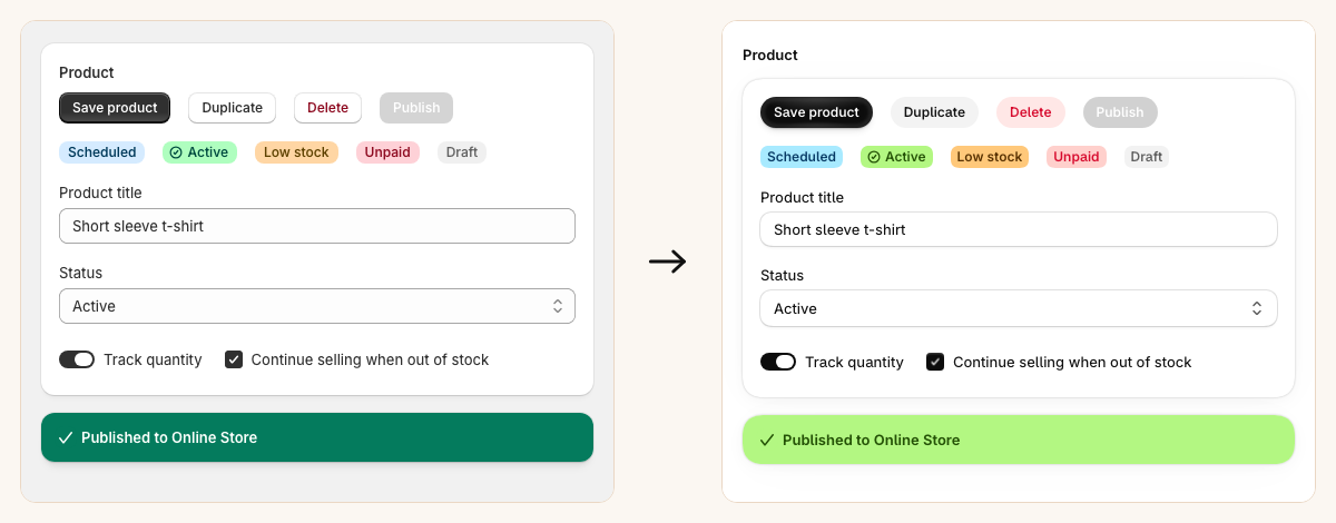
From September 15, 2026, the Shopify admin gets a new look, and Polaris 2 is the web component release that carries it into embedded apps. Shopify has shipped the library but no visual guide, so for app developers deciding what the upgrade means for their own screens, this page renders every component with both libraries: Polaris 1 on the left and Polaris 2 with the new admin look on the right, or old above new on a phone. Same markup on both sides, and everything is live, so hover, focus, and open the menus, popovers and modals. The design tokens behind the change are at the end.
Page
Where the redesign is most visible: white canvas, a smaller page title, section headings lifted out of their cards, larger card radius, pill buttons and a near-black primary action.
Section
The heading moves out of the card and sits above it. The card gains a 20px radius and a crisper shadow; with a white page behind it, the hairline border does the work that background contrast used to.
Heading
Darker ink and the new ShopifyInter face. Sizes are unchanged.
Text
Text moves from #303030 to #101010, and tone colors shift with the new status palette.
Paragraph
Same as text: darker ink and the new face. Line lengths barely move because the metrics are close to Inter.
Link
Link blue changes from #005bd3 to a lighter #3573f6, and the critical tone brightens.
Unordered list
Typography changes only.
Ordered list
Typography changes only.
Button
The biggest single change. Buttons become pills. Primary is near-black with a radial highlight; secondary loses its bevel and becomes flat light gray; the critical secondary gets a pink fill.
Button group
Inherits the button changes; spacing is unchanged.
Press button
Toggle buttons follow the pill shape; the pressed state is a filled gray pill.
Clickable
Takes the box changes plus the new hover fill.
Badge
Badges were already pastel. The hues shift (success from mint to yellow-green, info from sky blue to cyan, warning from peach to amber), text gets darker and more saturated, and padding tightens.
Banner
Success and warning banners drop their solid header fills for pastel ones with dark text; critical stays solid but brightens to a purer red. Corners round further and the action buttons become pills.
Chip
Chips keep their shape but take the new fills and ink.
Clickable chip
Same as chip, with the new hover and pressed fills.
Spinner
Unchanged apart from color.
Tooltip
Tooltips keep their dark surface. Hover the icon or the button.
Avatar
Avatar radius now scales with size and uses the superellipse where supported. Initials fills come from a new set of avatar colors.
Thumbnail
Media radius follows the same scaling rule as avatars.
Image
No change beyond the surface it sits on.
Icon
Default icon color darkens from #4a4a4a to #101010; tone colors follow the new status palette. The glyphs come from the same icon set.
Text field
Inputs go pure white with a soft shadow, a larger 12px radius and no blue focus outline. Minimum height drops by 2px. Click into one to compare focus.
Text area
Same treatment as text fields.
Number field
Same treatment as text fields.
Money field
Same treatment as text fields.
Email field
Same treatment as text fields.
Password field
Same treatment as text fields.
URL field
Same treatment as text fields.
Search field
Same treatment as text fields.
Select
Field styling as above. Open it to compare the option-item radius and the popover shadow.
Date field
Field styling as above. Open it to see the calendar popover.
Date picker
The selected day becomes a wide near-black pill instead of a square, and the calendar spreads out with more whitespace.
Color field
Field styling as above. Open it to see the picker popover.
Color picker
Handles and the hue slider get the new control-knob shadow.
Drop zone
Larger radius and a pill-shaped upload button.
Checkbox
The box shrinks from 16px to 14px, and the checked fill goes near-black with a subtle shadow instead of a flat fill.
Choice list
Radios and checkboxes shrink slightly and take the near-black checked fill.
Switch
The on state uses the brand fill, so it goes from charcoal to near-black; the knob gets a lighter shadow.
Table
Darker header and body text, a lighter row border, and badges inside cells pick up the new pastel hues.
Divider
Border tokens shift by a shade.
Box
Background and border tokens shift; the radius keywords map to the new, larger scale.
Stack
Layout primitive; no visual change of its own.
Grid
Layout primitive; no visual change of its own.
Scroll box
Layout primitive; no visual change of its own.
Query container
Layout primitive; no visual change of its own.
Popover
Popover radius grows from 12px to 16px and the shadow gets much lighter. Open it to compare.
Menu
Menu items take the larger option-item radius. Open it to compare.
Modal
Dialog radius grows from 16px to 24px with a much lighter shadow. Open it to compare.
Empty state
A centered graphic, heading, subheading and up to two actions for empty lists, tables and pages. New in Polaris 2.0.
Number
Inline numerals with tabular figures, tone, size and weight, so columns of figures line up. New in Polaris 2.0.
Design tokens
Polaris 1 hardcodes its colors, radii and shadows. Polaris 2.0 moves them onto roughly 500 design tokens and applies 178 overrides for the new look. These are the tokens that produce the differences above, with values as shipped in the release candidate. The token names carry a build hash in the bundle (for example --p-color-bg-656e1), so they are an internal mechanism rather than an override API.
| Token | Polaris 1 look | Polaris 2.0 new look | What it changes |
|---|---|---|---|
--p-color-bg | #f1f1f1 | #fff | Page background |
--p-color-text | #303030 | #101010 | Body text |
--p-color-text-secondary | #616161 | #606060 | Secondary text |
--p-color-text-tertiary | #616161 | #868686 | Tertiary text, now visibly lighter |
--p-color-icon | #4a4a4a | #101010 | Default icon color |
--p-color-text-link | #005bd3 | #3573f6 | Links |
--p-color-border-focus | #005bd3 | #3573f6 | Focus rings |
--p-color-border | #e3e3e3 | #e6e6e6 | Default border |
--p-color-bg-fill-brand | #303030 | #0c0c0c | Primary button fill |
--p-color-bg-fill-brand-hover | #1a1a1a | #000 | Primary button hover |
--p-color-bg-fill | #fff | #f3f3f3 | Secondary button fill |
--p-shadow-button | inset bevel | none | Secondary button bevel removed |
--p-color-button-gradient-bg-fill | linear gradient | radial gradient | Primary button highlight |
--p-border-radius-action | 8px | full (pill) | Buttons and chips |
--p-border-radius-container | 12px | 20px | Cards and sections |
--p-border-radius-dialog | 16px | 24px | Modals |
--p-border-radius-popover | 12px | 16px | Popovers and menus |
--p-border-radius-control | 8px | 12px | Inputs and selects |
--p-border-radius-element | 8px | 10px | Generic element radius |
--p-border-radius-corner-shape | normal | superellipse(1.333) | Corner curvature where the browser supports it |
--p-color-input-bg-surface | #fdfdfd | #fff | Input background |
--p-shadow-input | none | soft drop shadow | Inputs gain a shadow |
--p-border-width-outline-input-focus | 2px | none | Focus outline replaced by shadow |
--p-height-field-min-block-size | 32px | 30px | Fields are slightly shorter |
--p-space-choice-size | 16px | 14px | Checkbox and radio size |
--p-color-bg-fill-success | #047b5d | #b3f782 | Success fill |
--p-color-text-success | #014b40 | #306b06 | Success text |
--p-color-bg-fill-info | #91d0ff | #a8eaff | Info fill |
--p-color-text-info | #003a5a | #025e8d | Info text |
--p-color-bg-fill-warning | #ffb800 | #ffc87a | Warning fill |
--p-color-text-warning | #5e4200 | #b95d00 | Warning text |
--p-color-bg-fill-caution | #ffe600 | #ffe45c | Caution fill |
--p-color-bg-fill-critical | #c70a24 | #eb0014 | Critical fill |
--p-color-text-critical | #8e0b21 | #d70b2e | Critical text |
--p-color-text-ai | #5700d1 | #672ff4 | AI accent |
--p-color-nav-bg | #ebebeb | #0a0a0a | Admin navigation (the host frame, not app content) |
--p-shadow-container | soft diffuse | hairline plus soft spread | Card shadow |
--p-shadow-dialog | large and dark | small and light | Modal shadow |
--p-font-family-sans | Inter | ShopifyInter | Typeface |
A few tokens are conditional: control radii grow on touch devices, avatars and media round out, and the superellipse corner shape applies only in browsers that support corner-shape. The same component can therefore look slightly different by device without any code change.
A note on timing: the notes and token values on this page come from our analysis of the Polaris 2.0 release candidate as served on September 16, 2026. The rendered examples are live, though: both libraries load from Shopify’s CDN when you open the page, polaris-1.js for the stable Polaris 1 channel and polaris-2.0-rc.js for the release candidate, falling back to the stable polaris-2.js channel once the release candidate is retired. So the examples track what Shopify currently ships, and some details in the text may have changed since our analysis. Shopify’s own announcement is Prepare your app for the Shopify admin’s new look.
OptionWise is a Shopify product options app that renders options server-side, so they load with the page and are visible to search engines and AI assistants. Its admin is built on Polaris web components, which is why we track these releases closely.